

Our new identity didn't appear by magic. Sabrina Thibault, from Bite Size, is to thank for the art direction. We asked her a few questions to clarify all the elements that make up our new image.
Sabrina, what makes you the right person for us?
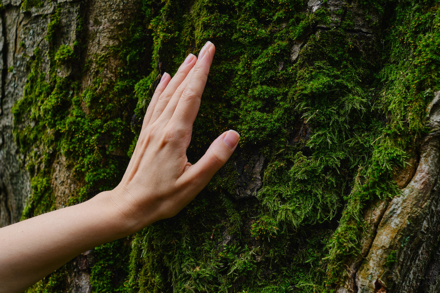
I have been in the creative field for over 15 years. I have helped many clients with their brand design, and more specifically with their product packaging, over the past few years. I think that being a woman and understanding the body care industry and the predominantly female clientele was also an asset. I like to take care of my skin, even more so if I can do it with products from home. I also have a strong penchant for buying local and a strong ecological conscience. I have an artistic sensibility, but I also care about environmental issues. Well-being is also about what we apply on our bodies.

Could you describe our new artistic direction in three words?
Harmony. Nature. Accessibility.
What were your main inspirations for the design of our packaging, and how do they help communicate our new identity to our customers?
The new brand image was inspired by the simplicity and efficiency of Nordic design. The North, Quebec nature and Chanv Oil™ were the guidelines for creating this image. Everything in it is thoughtful and personalized according to these elements. From the color of the packaging that evokes the natural fiber of the chanv, through the graphic elements, to the logo.

Can you explain how you created our logo and avatar? How do these elements contribute to our brand recognition?
The logo is done in a round, lowercase typography that is meant to be accessible and comforting. The "N" in Chanv is its heart. It evokes nature and the North. From it we created a symbol that combines the main elements of our brand: northernness and Chanv Oil™. We see a star that reminds us of the North Star symbolizing the North, from which a drop representing Chanv Oil™, the flagship ingredient of all our products, flows. The result is a unique and easily recognizable avatar that represents the essence of the brand and contains the main elements that make it up.
On our new packaging, we notice lines and waves. Can you explain their meaning?
We wanted to create a distinctive graphic element for the brand. An illustrated representation of the Northern Hemisphere, with its lines of latitude following the curve of the earth. On the products and packaging, two of them are turned over, their opposition creating a balance, a harmony, with the brand in the center. On these organic stripes, we can also see the undulation of the natural Quebec spring water at the base of our products.
How did you determine the color navigation system for the different product categories? How does this system improve the shopping experience for our customers?
Each color evokes the great northern spaces of the Quebec environment. Purple has been associated with facial care. Inspired by flora, it recalls the delicacy of flowers. Green was associated with the body care category, to recall the forest that covers a large part of our territory. Scalp care was associated with the color blue, to recall the water we use to wash our hair, and for the sky, near our head. The treatment care was assigned the color orange to recall the autumn leaves and the bark of trees, which provides protection. The colors are bold and easy to distinguish. If you know what you are looking for, you know right away what color to look for.
The brand identity that you developed is available on our new website and on our social networks. How do these new pages differ from the old ones?
They are more streamlined, making them easier to navigate and understand. The more modern aesthetic can also open the door to a younger clientele.
Would you say that our new brand identity reflects the company's values? If so, how?
Yes, it's simple, accessible and effective while honoring the northern nature of our products.
How do you see our brand evolving? How can we continue to innovate while staying true to our identity?
By using more and more environmentally friendly packaging. By adding new products with local ingredients. By increasing our points of sale and our accessibility.
The competition is tough in the cosmetics industry. How do you think this new artistic direction will make a difference?
The beige color of the products and packaging is different from the white products that are usually seen on the market. We are moving away from generic logos that can be used for any brand to come up with a personalized and unique logo that communicates our raison d'être and our values, which are also those of our customers.